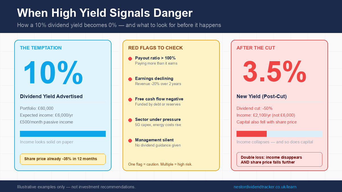
A 10% dividend yield looks like a shortcut to financial independence. If you need £2,000 a month in passive income — roughly £25,000 a year before tax — a 10% yielder means you only need a £250,000 portfolio to get there. At 5%, you'd need £500,000. That's half the capital, which could mean years shaved off your saving timeline.
The logic is impeccable. The maths checks out. And it's exactly why dividend yield traps are so dangerous.
When a stock's yield spikes to 8%, 10%, or 12%, it's often not because the company is being extraordinarily generous. It's because the share price has collapsed — and the market is already pricing in a dividend cut that hasn't been announced yet. When the cut arrives, investors face a double loss: the income disappears, and the share price typically falls again as disappointed holders sell. The "shortcut" becomes a detour that sets your financial independence timeline back significantly.
This article unpacks how yield traps work, how to spot them before they spring, and why the research consistently shows that dividend growth outperforms high yield over time.
Why a High Yield Is Often a Warning, Not a Gift
The dividend yield formula is simple: annual dividend divided by share price. A company paying £1 per share when the stock trades at £20 yields 5%. If the share price drops to £10 without a dividend cut, the yield doubles to 10% — purely mechanically, with no change to the actual income.
This is the yield trap mechanism. When a company's fundamentals deteriorate — earnings falling, debt rising, cash flow drying up — investors sell. The share price falls. The advertised yield rises. New investors see a tempting number on their broker's stock screener, buy in expecting high income, and then receive the dividend cut announcement a few months later.
The market is forward-looking. A yield of 10% on a FTSE 100 stock — where the historical average is around 3.5% — is nearly triple the benchmark. That extreme gap often reflects the market's collective judgment that the current dividend is unsustainable. The yield is high because it won't stay that way.
It is worth being precise here: not every high yield is a trap. Some sectors — utilities, real estate investment trusts, infrastructure — genuinely sustain high yields because of stable, long-term contracted cash flows. The question is always whether the yield is structurally supported, or whether it's an artefact of a declining share price that the market has already written down.
Three Real Yield Traps — What the Data Was Saying
The most instructive way to understand yield traps is to look at examples where the warning signs were clearly visible before the cut was announced. All three examples below are historical and illustrative only — they are not recommendations to buy, sell, or hold any security.
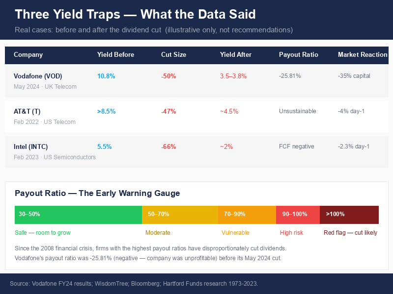
Vodafone — 10.8% Yield, Then a 50% Cut
In early 2024, Vodafone's trailing dividend yield was sitting at approximately 10.8%. For a FTSE 100 household name, that number alone should have raised questions — it was nearly three times the index average.
But dig a layer deeper and the warning signs were explicit. Vodafone's payout ratio was negative 25.81%. A negative payout ratio means the company was unprofitable — it was paying dividends out of cash reserves, asset sales, or debt, not from earnings. The dividend coverage ratio was just 0.8, meaning Vodafone's earnings wouldn't even cover 80% of what they were paying out. The company was, in effect, borrowing from its own financial future to maintain a dividend its fundamentals could not support.
In May 2024, with their full-year results, Vodafone cut the dividend by 50% — from 9.0 eurocents per share to 4.5 eurocents. The current yield, post-cut, is approximately 3.5–3.82%. Anyone who bought at the 10.8% yield expecting sustainable income is now receiving roughly a third of what they projected — and would have also experienced capital losses as the share price was under sustained pressure.
AT&T — "Safe" Telecom, 47% Cut
For years, AT&T was considered a reliable high-yield income stock. Telecoms seemed like a safe bet: essential services, recurring revenue, predictable cash flows. By February 2022, AT&T's yield was above 8.5% — again, a level the market was flagging as unsustainable.
The cut came on February 1, 2022: a 47% reduction from $2.08 to $1.11 per share annually. The rationale was the WarnerMedia spinoff and the pressing need to reduce AT&T's significant debt load while funding 5G network deployment and fibre expansion. Shares fell more than 4% immediately following the announcement.
The "safe telecom" framing turned out to obscure the underlying financial reality: years of heavy capital expenditure and strategic acquisitions had created a debt burden the company needed to address. The dividend was the lever they pulled.
Intel — 5.5% Yield, Then a 66% Cut
Intel's cut in February 2023 illustrates how severe dividend cuts can be when underlying financials collapse. The quarterly dividend was reduced by 66% — from $0.365 to $0.125 per share. The yield fell from 5.5% to around 2%.
The financial context made the cut understandable in hindsight. In 2022, Intel's revenue had fallen 20% to $63 billion. Free cash flow turned negative — minus $4 billion. The company needed to preserve the roughly $6 billion annual cost of the dividend for critical investments in its foundry strategy and new US manufacturing facilities during a severe semiconductor market downturn. The stock fell 2.3% on the announcement, but analysts noted the market had largely anticipated the cut — a sign that the financial deterioration had already been priced in.
Five Red Flags Before a Dividend Cut
These three cases share a common pattern: clear warning indicators were present well before the cut announcements. Knowing what to look for gives you the opportunity to reassess before you're caught in the double loss.
| Red Flag | What It Tells You | Threshold to Watch |
|---|---|---|
| Payout ratio above 100% | Company is paying out more than it earns | Any ratio above 100% is a red flag; 70–90% leaves little margin |
| Declining earnings or revenue | The earnings base supporting the dividend is shrinking | Two or more consecutive quarters of meaningful decline |
| Negative or falling free cash flow | Cash generation can't fund the dividend without borrowing | Negative FCF while maintaining high dividend = unsustainable |
| Rising debt levels | Company borrowing to pay dividends or cover operations | Debt-to-equity trending up while coverage ratios fall |
| Sector-wide pressure | Industry headwinds affect all players simultaneously | 5G capex for telecoms; commodity price falls for miners |
| Management silence on dividends | Companies that are confident in their dividend say so explicitly | Forward guidance that avoids dividend commentary is a signal |
Industry research consistently shows that since the 2008 financial crisis, firms with the highest payout ratios have disproportionately been those that subsequently cut dividends. A single red flag warrants attention. Multiple flags appearing together is a serious signal to investigate further.
It is also worth considering sector context. During 2020, approximately half of all FTSE 100 companies cut or suspended dividends due to COVID-19, with total Q2 2020 payouts falling £22 billion year-on-year. By mid-year, 24 companies had announced cuts in early April, escalating to roughly half the index by mid-2020. BT Group, Centrica, and Marks & Spencer all cancelled dividends that had previously appeared solid. This illustrates that yield traps are not only a company-specific risk — during systemic shocks, entire sectors can experience simultaneous cuts, and even traditionally "safe" income stocks are not immune.
The Double Loss — Income AND Capital
The yield trap doesn't just cost you income. It typically costs you capital too. Here is a worked example to make the arithmetic concrete.
Say you invest £60,000 in a stock yielding 10% gross. You expect £6,000 a year in dividends — £500 a month, which might be exactly the passive income target you were working towards.
What actually happens:
-
The share price is high-yield because it has already fallen significantly. You've bought at a depressed price — but you don't know it's depressed, because the high yield signals opportunity.
-
The dividend cut is announced. In line with the Vodafone example, say it's a 50% cut. Your projected £6,000/year income becomes £3,000. The £500/month target is now £250/month.
-
The share price falls further on the announcement as disappointed investors sell. Your £60,000 holding might now be worth £45,000–£50,000, depending on the severity of the cut and market reaction.
-
You've lost both the income you planned for and a chunk of the capital you invested.
The total hit is not just the income reduction. It's the income reduction plus the capital loss on the underlying holding. This is why yield traps are so financially damaging compared to other investment mistakes — the penalty comes from two directions simultaneously.
At the April 2026 UK dividend tax rates, this pain is compounded further for anyone holding high-yielding shares in a General Investment Account rather than an ISA. If a 10% gross yield was generating dividend income above the £500 allowance, basic rate taxpayers now owe 10.75% on the excess (up from 8.75% before April 2026), and higher rate taxpayers owe 35.75%. The real net income was already lower than the gross yield suggested — and the cut then reduces even that smaller number.
Why Dividend Growth Beats High Yield — The 50-Year Case
The data on this question is remarkably consistent. Hartford Funds research, covering 50 years of S&P 500 data from 1973 to 2023, found that stocks which grew or initiated dividends delivered an annualised return of 10.7%. Stocks that paid no dividend at all returned just 4.8% annualised over the same period. The S&P 500 as a whole — including all categories — returned 8.2%.
This performance gap reflects something important about what dividend growth signals. A company that consistently increases its dividend each year is demonstrating earnings growth, balance sheet discipline, and management confidence in the business's future. The dividend growth is not the cause of the outperformance — it's a symptom of the underlying financial quality that drives it.
The mathematical case for dividend growth over high yield becomes visible over time. Consider two starting positions:
Option A: A stock with a 3% yield, growing its dividend at 8% per year. Option B: A stock with a 6% flat yield, paying the same amount each year with no growth.
Option B looks obviously better from day one. You're getting twice the income immediately. But compound interest works slowly and then all at once.
| Year | 3% Yield Growing at 8%/yr | 6% Flat Yield |
|---|---|---|
| Year 1 | 3.00% | 6.00% |
| Year 3 | 3.50% | 6.00% |
| Year 5 | 4.08% | 6.00% |
| Year 7 | 4.41% | 6.00% |
| Year 9 | 4.77% | 6.00% |
| Year 10 | 5.16% | 6.00% |
| Year 11 | 6.48% | 6.00% |
| Year 13 | 7.56% | 6.00% |
| Year 15 | 8.16% | 6.00% |
Yield expressed as percentage of original cost (yield on cost). Illustrative calculation — past performance does not guarantee future results.
By Year 11, the growing dividend has overtaken the flat one on a yield-on-cost basis. By Year 15, the grower is delivering 8.16% on your original investment while the "high yielder" still delivers 6% — assuming the flat yield survived that long without a cut, which, as we have seen, is far from guaranteed.
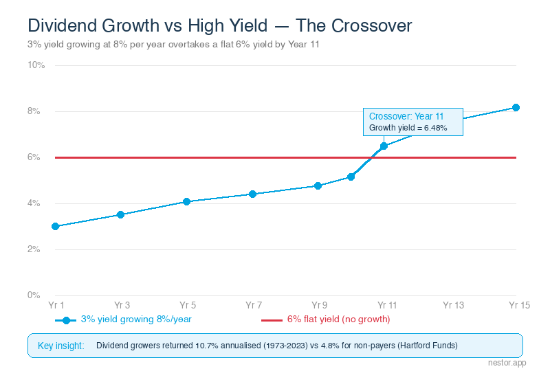
The flat 6% yielder carries ongoing cut risk every year. The growing 3% yielder, by contrast, is demonstrating financial health through each increase. The risk profiles of these two investments are profoundly different, even though the starting yields differ by only three percentage points.
The Psychology Behind Yield Traps — Why We Fall For Them
Understanding why yield traps are effective is as useful as knowing how to spot them. Behavioural finance research identifies several cognitive patterns that make high-yield stocks particularly attractive to retail investors — even when the warning signs are present.
Anchoring bias is the tendency to fixate on the first number you see. When you open your broker's stock screener and filter for high yield, you anchor to the 10% figure. That number becomes your reference point for everything else. The share's underlying fundamentals get evaluated relative to whether they justify the yield you've anchored to, rather than assessed independently.
Loss aversion — which research identifies as having the strongest influence on retail investment decisions — creates a specific trap once you're invested. Having bought at 10%, you are deeply reluctant to sell at a loss when the warning signs emerge. The pain of crystallising a capital loss feels more acute than the abstract risk of a future dividend cut. So you hold, and the cut eventually arrives anyway.
Recency bias makes a stock that has paid a high dividend for two or three years feel reliable. The recent track record creates an expectation that the future will resemble the recent past — even when the balance sheet is clearly deteriorating.
These biases combine to create a pattern where investors are attracted by high yield, anchored to that number, reluctant to sell as fundamentals worsen, and then hit by a double loss when the cut arrives. Recognising these tendencies in yourself is the first step to evaluating yield figures more dispassionately.
How to See This in Your Portfolio
The most useful question when evaluating any high-yielding position is not "what is the yield?" but "what does the dividend history look like?" A company that has paid and grown its dividend for 10 consecutive years is a fundamentally different proposition from one showing a high yield with a two-year track record.
Nestor's stock detail screen shows the dividend history for each holding — not just the current payment, but the trend over time. You can see whether the dividend has been growing, staying flat, or declining quarter by quarter. The dividend streak indicator shows how many consecutive periods the company has paid or increased its dividend, which is a practical signal of underlying financial consistency.
If a holding is showing a very high yield and the dividend history shows a flat or declining trend over recent quarters — that combination is an early warning signal worth investigating. Compare it against the red flags table above: check the payout ratio via your broker or a financial data site, look at the earnings trend, and consider the sector context.
The goal is to move from evaluating yield in isolation — a single number that can be deeply misleading — to evaluating yield in context: alongside dividend history, payout sustainability, earnings trend, and debt levels. It takes a few extra minutes per holding, but it's the difference between income investing and income gambling.
The One Thing to Remember
A high dividend yield is not a shortcut to financial independence — it is frequently a warning.
When a stock's yield spikes to 10% or 12%, the market has usually already priced in the cut. Buying that yield means accepting the risk that the income will shrink and the capital will fall simultaneously. The 50-year data from Hartford Funds makes the alternative clear: dividend growers returned 10.7% annualised versus 4.8% for non-payers over the same period. Consistency and growth compound far more powerfully than a high number that doesn't last.
Look for dividend growth, not just dividend size. The highest yield in the room is often the most dangerous one.